A review of 10 shopping mall apps
2020 was a revolutionary year for everything online. The pandemic accelerated a great many trends: what should have taken years to develop arrived over a few months of lockdown. Mobile traffic grew noticeably during those months of isolation.
Analysts at SlickJump noted that mobile traffic on the Russian internet reached 80%, pushing out desktops and laptops. Lockdown took the offline world away from people, and they began working, living and entertaining themselves online.
In the second quarter of 2020, during the first wave of COVID-19, people spent 40% more time in apps each day than they had in 2019, according to research by the analytics firm App Annie.
It did not take long for that to show up in the financial numbers.
By App Annie's count, users in Russia spent 1.2 billion in mobile apps over the year. AppsFlyer offers the global figure: at the start of the pandemic, app publishers' revenue rose by 52%.
Shopping malls are a field where a mobile app solves a whole range of problems — and not just supplying reference information such as a map, opening hours and a store directory. An app helps build the right kind of communication: it entertains, informs, draws people into loyalty programs and gathers data on shopping preferences. That makes it a marketing instrument in its own right.
As of January 2020, the Roomfi.ru directory of commercial real estate in Moscow and the Russian regions listed 512 shopping malls in the capital. Yet no more than 50 malls offer a mobile app on Google Play.
We looked at the mobile apps of 10 shopping malls from a user experience standpoint:
- 1MEGA
- 2Metropolis
- 3AFIMALL City
- 4Vodny
- 5Galeria
- 6Riviera
- 7Salaris
- 8Kashirskaya Plaza
- 9Columbus
- 10M5 Mall
We settled on three criteria:
- Visual appeal.
- Ease and clarity of use.
- Distinctiveness of the content.
Design and visual appeal
Thousands of new apps appear on the App Store and Google Play every month, and design is the first line in the battle for attention. It is design that governs how using the product feels. Copy, type, color and composition are what set the mood and the emotional tone of the conversation.
To our eye, the title of brightest and most appealing can safely go to the MEGA app.
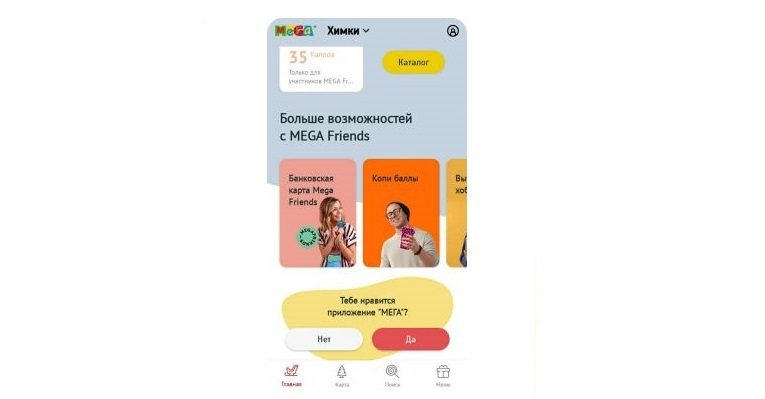
A handsome app in which the current trends are plain to see: minimalism, restraint, personalization and a bottom tab bar. You can tell it was built with the product's marketing goals in mind.
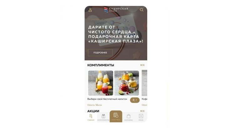
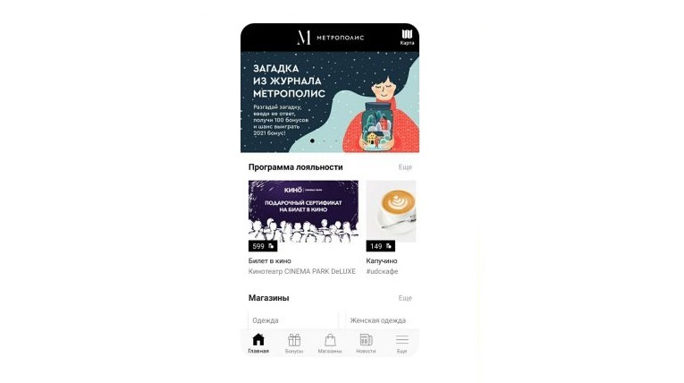
The apps from Metropolis, AFIMALL City, Kashirskaya Plaza and Galeria are conscientiously made too. The composition is clear, every element sits well with the others and adds up to a whole, and the typography is handled competently. With design like this, users stay focused on shopping instead of wrestling with a technical puzzle.
Ease and clarity of use
The simpler and more convenient an app is, the more popular it gets. If users can figure it out unaided and reach what they came for in three taps, they will consider it useful.
The home screens of Metropolis, AFIMALL City, Kashirskaya Plaza and Galeria carry the loyalty program, a store directory and the latest news. The menu block sits at the bottom. Its visible part repeats the sections from the home screen, and tapping Menu opens the full list: entertainment, parking payment, contacts, the mall map, the loyalty program and the cinema.
At Metropolis and Galeria the store map is pulled out into an icon in the top right corner of the screen. AFIMALL City's map and Kashirskaya Plaza's Navigation section live inside the menu.
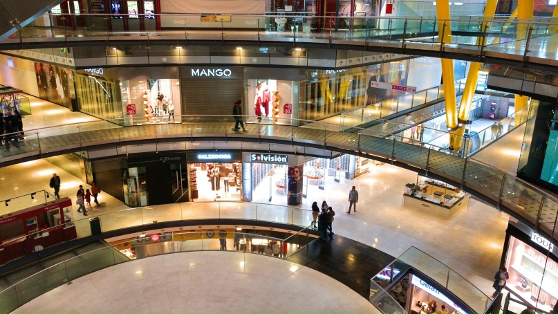
The AFIMALL City app asks you to sign up the moment you open it. In return the mall promises discounts, gifts and access to invitation-only events.
The MEGA app is built on a similar frame: the same bottom menu, no separate icon for the mall map, and sign-in required for the fuller set of services. But the resemblance ends there. Most sections branch into several levels, and a few — Food or Services, say — look like standalone apps.
These apps satisfy the three-tap rule without any trouble. We reached everything we were after in fewer taps than that.
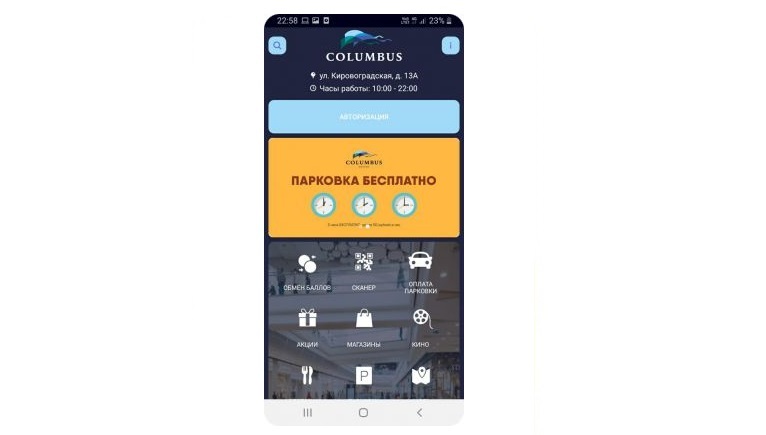
Salaris and Columbus lay their content out on an entirely different principle. The home screen holds icons for every section at once, in a single block. There is no bottom menu, but a strip of promotional banners takes up the top quarter of the screen, and the header carries an oversized logo along with the mall's contact details.
The Vodny and M5 Mall apps offer yet another approach. Their home screens are split vertically into two equal halves forming a feed of promotional banners and useful information. To find out what other sections exist, you have to open the one and only menu by tapping the icon in the top right corner. Getting your bearings in a layout like this and finding what you need will not be easy.
Content
The prototype of the modern mall app appeared in late 2012. It was Wizee Shopping, which showed visitors where the stores, restaurants, restrooms and other useful places were in a mall. In essence it was a virtual directory.
Today, to hold on to its users, an app has to offer entertainment alongside reference content: rankings, quizzes, games, video. That is what gets people opening it more often.
For convenience we sorted the sections found in mall apps into three groups:
- Mandatory. A map or floor plan of the mall and a store directory. These appear in every mall app and hold nothing but reference information.
- Standard. The sections most malls have: promotions, points and perks, loyalty programs, restaurants, entertainment and cinema, feedback, a news feed, services, parking. What these sections do is add emotion for the user — which is to say, they are an excellent way to bring in an element of gamification.
- Rare. Fitness, a rewards card, hands-free shopping, a gift card, cashback, favorite stores, refer a friend. These are the sections that make an app distinctive.
Every app on our list has the sections from the first group.
The differences start in the second. Metropolis and Galeria, for instance, have no dedicated section for promotions and discounts. A list of restaurants and cafes with reviews, contacts and a description of the cuisine was skipped by Metropolis, AFIMALL City and Galeria.
You can buy cinema tickets and check showtimes in all of them except MEGA, AFIMALL City and Salaris. Incidentally, the loyalty program that so many now treat as obligatory was first launched by AFIMALL City.
In the third group the MEGA app stands out with its hands-free shopping service. It works like this: you leave your paid-for purchases at the store's checkout and get a QR code in exchange, then collect everything at a dedicated pick-up point before you leave the mall.
Another interesting section of the same app is Events, which hosts online events you can attend straight from your phone. A useful thing for anyone killing time while a friend finishes shopping. MEGA has managed to build a genuine ecosystem inside its app: it will feed you, dress you, look after you and — most importantly — entertain you.
The Galeria and Columbus apps have one genuinely useful service: their users can pay for parking from their phone.
In summary
For now it is fair to say that marketers are not making full use of what a mall app can do to engage and retain an audience.
Only a handful of malls genuinely interact with shoppers, run loyalty programs that work and draw people into something interactive: MEGA, Metropolis, AFIMALL City, Galeria and Columbus. The rest still look more like information directories.
Why is that?
One likely reason is how much a good app costs to build. Plenty of IT companies are ready to offer their services, but not every mall can afford to pay for the work.
Another may be how long development takes — six to twelve months, and in some cases longer.
And finally, writing the specification can be hard going. To design and describe interesting services for an app, somebody has to think them up first.
Solve those problems and perhaps more malls will end up with modern, capable mobile apps.